Widgets
In this chapter, we will show small examples of several widgets, available in wxWidgets. Widgets are building blocks of our applications. wxWidgets consists of a large amout of useful widgets. Widget is a basic GUI object by definition. A widget gave wxWidgets toolkit a name. This term is used on Linux systems. On Windows, a widget is usually called a control.
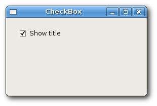
wxCheckBox
wxCheckBox is a widget that has two states. On and Off. It is a box with a label. The label can be set to the right or to the left of the box. If the checkbox is checked, it is represented by a tick in a box. A checkbox can be used to show/hide splashscreen at startup, toggle visibility of a toolbar etc.
checkbox.bmx <- Open sourceSuperStrict Framework wx.wxApp Import wx.wxFrame Import wx.wxCheckBox Import wx.wxPanel Const ID_CHECKBOX:Int = 100 New MyApp.Run() Type MyApp Extends wxApp Method OnInit:Int() Local cb:CheckBox = CheckBox(New CheckBox.Create(Null, wxID_ANY, .. "CheckBox", -1, -1, 270, 150)) cb.Show(True) Return True End Method End Type Type CheckBox Extends wxFrame Field m_cb:wxCheckBox Method OnInit() Local panel:wxPanel = New wxPanel.Create(Self, wxID_ANY) m_cb = New wxCheckBox.Create(panel, ID_CHECKBOX, "Show title", 20, 20) m_cb.SetValue(True) Connect(ID_CHECKBOX, wxEVT_COMMAND_CHECKBOX_CLICKED, OnToggle) Centre() End Method Function OnToggle(event:wxEvent) Local frame:CheckBox = CheckBox(event.parent) If frame.m_cb.GetValue() Then frame.SetTitle("CheckBox") Else frame.SetTitle("") End If End Function End Type
In our example, we display one checkbox on the window. We toggle the titlel of the window by clicking on the checkbox.
 m_cb = New wxCheckBox.Create(panel, ID_CHECKBOX, "Show title", 20, 20)
 m_cb.SetValue(True)
We create a checkbox. By default, the title is visible. So we check the checkbox by calling the method SetValue().
Connect(ID_CHECKBOX, wxEVT_COMMAND_CHECKBOX_CLICKED, OnToggle)
If we click on the checkbox, a wxEVT_COMMAND_CHECKBOX_CLICKED event is generated. We connect this event to the user defined OnToggle() function.
 If frame.m_cb.GetValue() Then
     frame.SetTitle("CheckBox")
 Else
     frame.SetTitle("")
 End If
Inside the OnToggle() method, we check the state of the checkbox. If it is checked, we display "CheckBox" string in the titlebar, otherwise we show empty string.
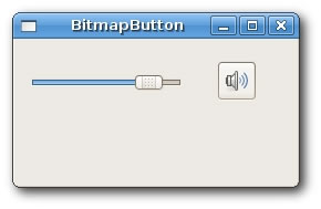
wxBitmapButton
A bitmap button is a button, that displays a bitmap. A bitmap button can have three other states. Selected, focused and displayed. We can set a specific bitmap for those states.
SuperStrict Framework wx.wxApp Import wx.wxFrame Import wx.wxSlider Import wx.wxBitmapButton Import wx.wxPanel Const ID_SLIDER:Int = 100 New MyApp.Run() Type MyApp Extends wxApp Method OnInit:Int() Local bb:BitmapButton = BitmapButton(New BitmapButton.Create(Null, .. wxID_ANY, "BitmapButton", -1, -1, 250, 130)) bb.Show(True) Return True End Method End Type Type BitmapButton Extends wxFrame Field slider:wxSlider Field button:wxBitmapButton Field pos:Int Method OnInit() wxImage.AddHandler( New wxPNGHandler ) Local panel:wxPanel = New wxPanel.Create(Self, wxID_ANY) slider = New wxSlider.Create(panel, ID_SLIDER, 0, 0, 100, 10, 30, 140, -1) button = New wxBitmapButton.Create(panel, wxID_ANY, .. wxBitmap.CreateFromFile("../media/mute.png", .. wxBITMAP_TYPE_PNG), 180, 20) Connect(ID_SLIDER, wxEVT_COMMAND_SLIDER_UPDATED, OnScroll) Centre() End Method Function OnScroll(event:wxEvent) Local frame:BitmapButton = BitmapButton(event.parent) frame.pos = frame.slider.GetValue() If frame.pos = 0 Then frame.button.SetBitmapLabel(wxBitmap.CreateFromFile(.. "../media/mute.png", wxBITMAP_TYPE_PNG)) Else If frame.pos > 0 And frame.pos <= 30 Then frame.button.SetBitmapLabel(wxBitmap.CreateFromFile(.. "../media/min.png", wxBITMAP_TYPE_PNG)) Else If frame.pos > 30 And frame.pos < 80 Then frame.button.SetBitmapLabel(wxBitmap.CreateFromFile(.. "../media/med.png", wxBITMAP_TYPE_PNG)) Else frame.button.SetBitmapLabel(wxBitmap.CreateFromFile(.. "../media/max.png", wxBITMAP_TYPE_PNG)) End If End Function End Type
In our example, we have a slider and a bitmap button. We simulate a volume control. By dragging the handle of a slider, we change a bitmap on the button.
wxImage.AddHandler( New wxPNGHandler )
We will use PNG images, so we must initialize a PNG image handler.
 button = New wxBitmapButton.Create(panel, wxID_ANY, ..
     wxBitmap.CreateFromFile("../media/mute.png", ..
     wxBITMAP_TYPE_PNG), 180, 20))
We create a bitmap button. We specify a bitmap type, in our case wxBITMAP_TYPE_PNG
pos = slider.GetValue()
We get the slider value. Depending on this value, we set a bitmap for our button. We have four volume states. Mute, minimum, medium and maximum. To change a bitmap on the button, we call the SetBitmapLabel() method.
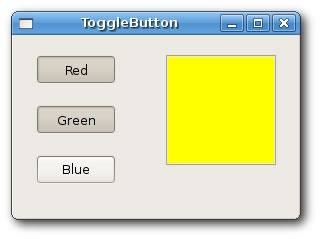
wxToggleButton
wxToggleButton is a button that has two states. Pressed and not pressed. You toggle between these two states by clicking on it. There are situations where this functionality fits well.
SuperStrict Framework wx.wxApp Import wx.wxFrame Import wx.wxToggleButton Import wx.wxPanel Const ID_TGBUTTON1:Int = 101 Const ID_TGBUTTON2:Int = 102 Const ID_TGBUTTON3:Int = 103 New MyApp.Run() Type MyApp Extends wxApp Method OnInit:Int() Local toggle:ToggleButton = ToggleButton(New ToggleButton.Create(Null, .. wxID_ANY, "ToggleButton", -1, -1, 280, 180)) toggle.Centre() toggle.Show(True) Return True End Method End Type Type ToggleButton Extends wxFrame Field m_tgbutton1:wxToggleButton Field m_tgbutton2:wxToggleButton Field m_tgbutton3:wxToggleButton Field m_panel:wxPanel Field colour:wxColour Method OnInit() Local panel:wxPanel = New wxPanel.Create(Self, wxID_ANY) colour = New wxColour.Create(0, 0, 0) m_tgbutton1 = New wxToggleButton.Create(panel, .. ID_TGBUTTON1, "Red", 20, 20) m_tgbutton2 = New wxToggleButton.Create(panel, .. ID_TGBUTTON2, "Green", 20, 70) m_tgbutton3 = New wxToggleButton.Create(panel, .. ID_TGBUTTON3, "Blue", 20, 120) Connect(ID_TGBUTTON1, wxEVT_COMMAND_TOGGLEBUTTON_CLICKED, .. OnToggleRed) Connect(ID_TGBUTTON2, wxEVT_COMMAND_TOGGLEBUTTON_CLICKED, .. OnToggleGreen) Connect(ID_TGBUTTON3, wxEVT_COMMAND_TOGGLEBUTTON_CLICKED, .. OnToggleBlue) m_panel = New wxPanel.Create(panel, wxID_NEW, 150, 20, .. 110, 110, wxSUNKEN_BORDER) m_panel.SetBackgroundColour(colour) End Method Function OnToggleRed(event:wxEvent) Local tog:ToggleButton = ToggleButton(event.parent) Local green:Int = tog.colour.Green() Local blue:Int = tog.colour.Blue() If tog.colour.Red() Then tog.colour.Set(0, green, blue) Else tog.colour.Set(255, green, blue) End If tog.m_panel.SetBackgroundColour(tog.colour) End Function Function OnToggleGreen(event:wxEvent) Local tog:ToggleButton = ToggleButton(event.parent) Local red:Int = tog.colour.Red() Local blue:Int = tog.colour.Blue() If tog.colour.Green() Then tog.colour.Set(red, 0, blue) Else tog.colour.Set(red, 255, blue) End If tog.m_panel.SetBackgroundColour(tog.colour) End Function Function OnToggleBlue(event:wxEvent) Local tog:ToggleButton = ToggleButton(event.parent) Local red:Int = tog.colour.Red() Local green:Int = tog.colour.Green() If tog.colour.Blue() Then tog.colour.Set(red, green, 0) Else tog.colour.Set(red, green, 255) End If tog.m_panel.SetBackgroundColour(tog.colour) End Function End Type
In our example, we show three toggle buttons and a panel. We set the background color of the panel to black. The togglebuttons will toggle the red, green and blue parts of the color value. The background color will depend on which togglebuttons we have pressed.
colour = new wxColour.Create(0, 0, 0)
This is the initial color value. No red, green and blue equals to black. Theoretically speaking, black is not a color after all.
 m_tgbutton1 = new wxToggleButton.Create(panel, ID_TGBUTTON1, ..
                                 "Red", 20, 20)
Here we create a toggle button.
 Connect(ID_TGBUTTON1, wxEVT_COMMAND_TOGGLEBUTTON_CLICKED, ..
     OnToggleRed)
If we click on the toggle button, a wxEVT_COMMAND_TOGGLEBUTTON_CLICKED event is generated. We connect the event handlers for this event. Notice, that we don't connect events to the button methods, but to the wxFrame. widget, which is a grand parent of the toggle buttons. It is possible to do this, because command events are propagated to their parents. In our case, button -> panel -> frame. If we wanted to connect the event to the button, we would have to create our derived button classe, which would mean more work.
 If colour.Blue() Then
     colour.Set(red, green, 0)

 Else
     colour.Set(red, green, 255)
 End If
In the event handlers, we set the respective wxColour parameters.
m_panel.SetBackgroundColour(colour)
We set the background of the panel.
wxStaticLine
This widget displays a simple line on the window. It can be horizontal or vertical.
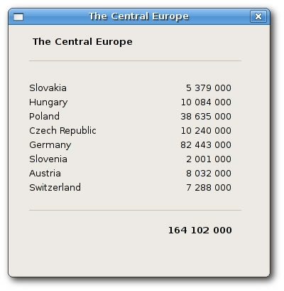
SuperStrict Framework wx.wxApp Import wx.wxDialog Import wx.wxStaticLine Import wx.wxStaticText New MyApp.Run() Type MyApp Extends wxApp Method OnInit:Int() Local sl:Staticline = Staticline(New Staticline.Create_(Null, wxID_ANY, .. "The Central Europe", -1, -1, 360, 350)) sl.ShowModal() sl.Destroy() Return True End Method End Type Type Staticline Extends wxDialog Method OnInit() Local font:wxFont = New wxFont.CreateWithAttribs(10, .. wxDEFAULT, wxNORMAL, wxBOLD) Local heading:wxStaticText = New wxStaticText.Create(Self, .. wxID_ANY, "The Central Europe", 30, 15) heading.SetFont(font) Local sl1:wxStaticLine = New wxStaticLine.Create(Self, .. wxID_ANY, 25, 50, 300,1) Local st1:wxStaticText = New wxStaticText.Create(Self, .. wxID_ANY, "Slovakia", 25, 80) Local st2:wxStaticText = New wxStaticText.Create(Self, .. wxID_ANY, "Hungary", 25, 100) Local st3:wxStaticText = New wxStaticText.Create(Self, .. wxID_ANY, "Poland", 25, 120) Local st4:wxStaticText = New wxStaticText.Create(Self, .. wxID_ANY, "Czech Republic", 25, 140) Local st5:wxStaticText = New wxStaticText.Create(Self, .. wxID_ANY, "Germany", 25, 160) Local st6:wxStaticText = New wxStaticText.Create(Self, .. wxID_ANY, "Slovenia", 25, 180) Local st7:wxStaticText = New wxStaticText.Create(Self, .. wxID_ANY, "Austria", 25, 200) Local st8:wxStaticText = New wxStaticText.Create(Self, .. wxID_ANY, "Switzerland", 25, 220) Local st9:wxStaticText = New wxStaticText.Create(Self, .. wxID_ANY, "5 379 000", 220, 80, 90, -1, wxALIGN_RIGHT) Local st10:wxStaticText = New wxStaticText.Create(Self, .. wxID_ANY, "10 084 000", 220, 100, 90, -1, wxALIGN_RIGHT) Local st11:wxStaticText = New wxStaticText.Create(Self, .. wxID_ANY, "38 635 000", 220, 120, 90, -1, wxALIGN_RIGHT) Local st12:wxStaticText = New wxStaticText.Create(Self, .. wxID_ANY, "10 240 000", 220, 140, 90, -1, wxALIGN_RIGHT) Local st13:wxStaticText = New wxStaticText.Create(Self, .. wxID_ANY, "82 443 000", 220, 160, 90, -1, wxALIGN_RIGHT) Local st14:wxStaticText = New wxStaticText.Create(Self, .. wxID_ANY, "2 001 000", 220, 180, 90, -1, wxALIGN_RIGHT) Local st15:wxStaticText = New wxStaticText.Create(Self, .. wxID_ANY, "8 032 000", 220, 200, 90, -1, wxALIGN_RIGHT) Local st16:wxStaticText = New wxStaticText.Create(Self, .. wxID_ANY, "7 288 000", 220, 220, 90, -1, wxALIGN_RIGHT) Local sl2:wxStaticLine = New wxStaticLine.Create(Self, .. wxID_ANY, 25, 260, 300, 1) Local sum:wxStaticText = New wxStaticText.Create(Self, .. wxID_ANY, "164 102 000", 220, 280) Local sum_font:wxFont = sum.GetFont() sum_font.SetWeight(wxBOLD) sum.SetFont(sum_font) Centre() End Method End Type
In the previous example, we show Centreal European countries and their populations. The use of wxStaticLine makes it more visually attractive.
Local sl1:wxStaticLine = New wxStaticLine.Create(Self, wxID_ANY, 25, 50, 300,1)
Here we create a horizontal static line. It is 300px wide. The height is 1px.
wxStaticText
A wxStaticText widget displays one or more lines of read-only text.
SuperStrict Framework wx.wxApp Import wx.wxFrame Import wx.wxPanel Import wx.wxStaticText New MyApp.Run() Type MyApp Extends wxApp Method OnInit:Int() Local st:StaticText = StaticText(New StaticText.Create(Null, wxID_ANY, .. "StaticText", -1, -1, 600, 130)) st.Show(True) Return True End Method End Type Type StaticText Extends wxFrame Method OnInit() Local panel:wxPanel = New wxPanel.Create(Self, wxID_ANY) Local text:String = "'Cause sometimes you feel tired,~n" + .. "feel weak, and when you feel weak, " + .. "you feel like you wanna just give up.~n" + .. "But you gotta search within you, " + .. "you gotta find that inner strength~n" + .. "and just pull that shit out of you " + .. "and get that motivation to not give up~n" + .. "and not be a quitter, " + .. "no matter how bad you wanna just fall flat on your face and collapse." Local st:wxStaticText = New wxStaticText.Create(panel, .. wxID_ANY, text, 10, 10, -1, -1, wxALIGN_CENTRE) Centre() End Method End Type
In our example, we display a part of the Eminem's Till I Collapse lyrics on the window.
   Local st:wxStaticText = New wxStaticText.Create(panel, ..
      wxID_ANY, text, 10, 10, -1, -1, wxALIGN_CENTRE)
Here we create the wxStaticText widget. The static text is aligned to the cetre.

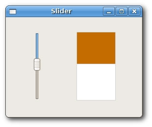
wxSlider
wxSlider is a widget that has a simple handle. This handle can be pulled back and forth. This way we are choosing a value for a specific task. Sometimes using a slider is more natural, than simply providing a number or using a spin control.
SuperStrict Framework wx.wxApp Import wx.wxFrame Import wx.wxPanel Import wx.wxSlider Const ID_SLIDER:Int = 100 New MyApp.Run() Type MyApp Extends wxApp Method OnInit:Int() Local sim:Slider = Slider(New Slider.Create(Null, wxID_ANY, .. "Slider", -1, -1, 270, 210)) sim.Show(True) Return True End Method End Type Type Slider Extends wxFrame Field panel:MyPanel Method OnInit() panel = MyPanel(New MyPanel.Create(Self)) Centre() End Method End Type Type MyPanel Extends wxPanel Field slider:wxSlider Field fill:Int Method OnInit() fill = 0 slider = New wxSlider.Create(Self, ID_SLIDER, 0, 0, 140, .. 50, 30, -1, 140, wxSL_VERTICAL) Connect(ID_SLIDER, wxEVT_COMMAND_SLIDER_UPDATED, OnScroll) ConnectAny(wxEVT_PAINT, OnPaint) End Method Function OnScroll(event:wxEvent) Local panel:MyPanel = MyPanel(event.parent) panel.fill = panel.slider.GetValue() panel.Refresh() End Function Function OnPaint(event:wxEvent) Local panel:MyPanel = MyPanel(event.parent) Local dc:wxPaintDC = New wxPaintDC.Create(panel) Local col1:wxColour = New wxColour.Create(212, 212, 212) dc.SetPen(New wxPen.CreateFromColour(col1)) dc.DrawRectangle(140, 30, 80, 140) Local col2:wxColour = New wxColour.Create(197, 108, 0) dc.SetBrush(New wxBrush.CreateFromColour(col2)) dc.DrawRectangle(140, 30, 80, panel.fill) dc.Free() End Function End Type
In our example, we display a slider widget. By pulling the handle of the slider, we control the background color of the panel. In such an example, using slider is more natural than using e.g. a spin control.
 slider = New wxSlider.Create(Self, ID_SLIDER, 0, 0, 140, 50, 30, ..
    -1, 140, wxSL_VERTICAL)
We create a vertical slider. The initial value is 0, minimal value is 0 and maximal value is 140. We display no ticks and no labels.
Connect(ID_SLIDER, wxEVT_COMMAND_SLIDER_UPDATED, OnScroll)
Here we connect a wxEVT_COMMAND_SLIDER_UPDATED event to the OnScroll() user defined method.
Connect(wxEVT_PAINT, OnPaint)
We will also do some drawing, so we connect OnPaint() method to the wxEVT_PAINT event.
 fill = slider.GetValue()
 Refresh()
In the OnScroll() method, we will get the current slider value. We call the Refresh() method, which will generate a wxEVT_PAINT event.
 dc.DrawRectangle(140, 30, 80, 140)
 ...
 dc.DrawRectangle(140, 30, 80, fill)
Inside the OnPaint() event handler, we draw two rectangles. The first method is draws a white rectangle with a gray border. The second method draws the a rectangle with some brownish color. The height of the rectangle is controled by the fill value, which is set by the slider widget.